

Videographer & Video Editor
Digital Marketing Campaign
Kamila Aisya Farisaputri
We created an in-depth assessment and critique of the current brand. This process helped us assess what works and what doesn’t and how we could use those insights to inform our new visual Identity.


Analyzing competitors is a key strategy for understanding our market position. After gathering information on the competitors, we created a comparison chart that includes key aspect, which visualized insights into potential opportunities.


Product Position
What doesn't work
We created an in-depth assessment and critique of the current brand. This process helped us assess what works and what doesn’t and how we could use those insights to inform our new visual Identity.
Being an idol isn't about flawless performance, instead, we position flaws and setbacks as unique selling points to depict their journeys as stories of resilience and determination.
Our brand underscores the concept of “pursuing your dreams with perseverance”. This narrative resonates deeply with fans, who see their own struggles and aspirations mirrored in the idols’ growth, transforming into a profound fan-idol relationship.
-> socioeconomic status mostly middle income and up (those with access to technology)
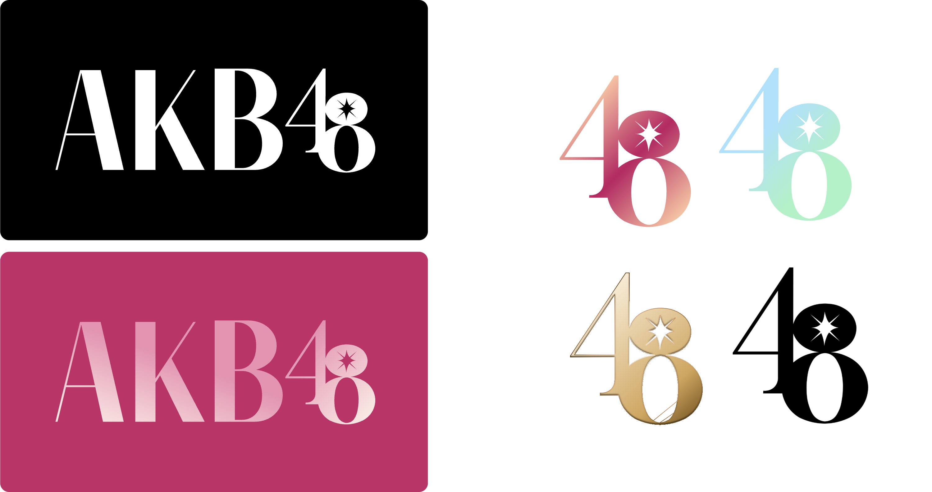

The choice of a thin, sans-serif font enhances the femininity of the brand.
The fusion of "48" within the logo serves as a distinctive mark for the brand's identity.
The shine in the icon represents dreams and success, abiding to our brand story on shared journey between Idols and fans.

After identifying the demographic and brainstorming the social media approach, we created a series of social posts such as Reels or TikTok’s promoting the brand using our new visual identity.
Social Campaign
Click the circles!


Target Demographic
- Teens to Young Adults (13-28 years old)
- Domestic (Japanese) and International fans of Japanese Pop Culture
- Both Male and Female fans


